Umami
Recipe App
Umami is an app that makes it easy to find recipes based on ingredients home cooks already have on hand - saving them time and money, enabling them to cook more nutritious meals, and reducing stress and waste.
Umami is an app that makes it easy to find recipes based on ingredients home cooks already have on hand - saving them time and money, enabling them to cook more nutritious meals, and reducing stress and waste.
This project was completed over three weeks by a team of five. The goal was to create a mid-fidelity prototype. We conducted user research, research analysis, created wireframes, received feedback and iterated designs.
We began to brainstorm what our user would look like for Umami. We decided it is someone with little free time to visit the store often, but wants to cook better meals.
We interviewed five users about their meal planning, shopping habits, and food waste. The results were compiled into an affinity diagram.
We then organized the affinity diagram into an empathy map to describe each user in four categories: ‘Sees,’ ‘Hears,’ ‘Says & Does,’ and ‘Thinks & Feels.’
Carlos, an exhausted nursing student with a busy schedule, needs help planning cheap and quick recipes because he is wasting valuable time and money on groceries that keep going bad.
The user scenario describes the struggle Carlos goes through when he spends on groceries and then doesn't know what to make.
The storyboard illustrates Carlos' journey to discover Umami. He initially is overwhelmed by how much he is spending on groceries and how much food he wastes. His friends recommend Umami, and he is exposed to many recipes he can make with the groceries he already has.
In order to identify which features to add to the Umami, we noted ideas into categories of 'I Like,’ 'I Wish,' and 'What If. We put items we liked in current applications in 'I Like', items we wanted in a new app into ‘I Wish,’ and ideas where the sky is the limit went into ‘What If.’
We then sorted those ideas by priority and feasibility and dot voted on the ideas
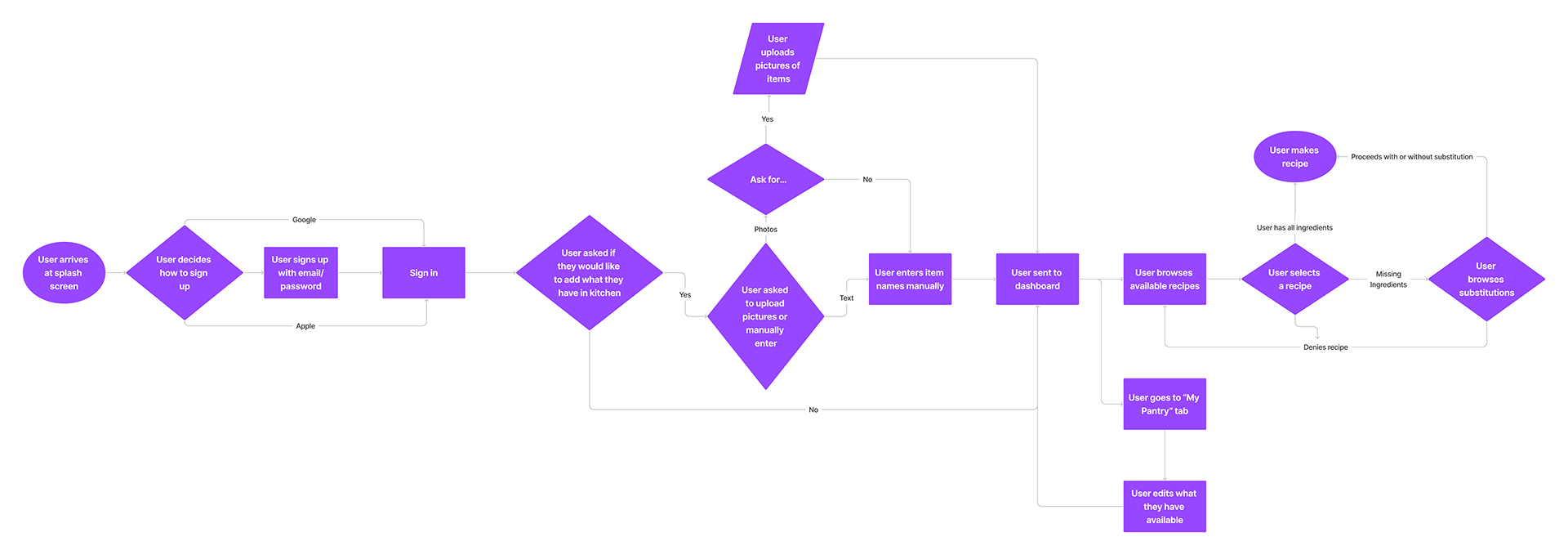
I designed our user flow to be straightforward for our users’ busy lifestyles. When the user opens the app, they can choose to sign up with Google, Apple, or email. They will then be asked if they would like to add the ingredients they have on hand, either by taking photos of items or entering them manually by name. On the dashboard, the user can browse recipes by what they have on hand.

Each member of the group sketched screens of the user flow. We voted on which screens we liked the best. I contributed the sign-up form and photo capture prompt screen.
Converting sketches to a low-fidelity prototype, we clarified how to add more ingredients on the 'My Pantry' screen by taking a photo or adding them by name manually.
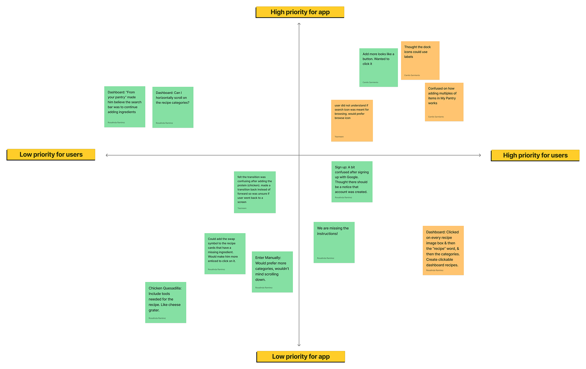
Our user testing plan included four tasks to be completed by three users. We had users create an account, add an ingredient to 'My Pantry,' select a recipe, and substitute an ingredient. Most users were able to complete these tasks, and we recorded feedback in a prioritization matrix.

In our final prototype, I enhanced the design to a mid-fidelity level by adding images, adding the ability to substitute ingredients, and cleaning up animations.
Our next steps to improve the project include adding expiration dates to ingredients that are editable. Users can go back into their pantry and change what will soon expire, allowing the user to know when or what to cook next.