Friends to the Forlorn Pitbull Rescue, Inc. is a volunteer-based 501(c)3 rescue and community outreach organization. The mission is to promote responsible pitbull ownership, provide breed education, combat pet overpopulation, fight unfair legislation, find qualified homes for sound pitbull-type dogs and other dogs in need in Georgia, and help people and animals within the community.
This project was completed in the span of three weeks under a team of 5. The goal was to identify the usability issues on the Friends to The Forlorn donation Pitbull Rescue website that users come across by evaluating concerns and incorporating simple alternatives for user experience.
We began to brainstorm what our user would look like for RhythmiQ. We decided it's someone with a unique music taste who wants to discover more indie artists.
Since we were dealing with a developed product already, we decided to perform usability tests on the current version of the website. We used 5 users to usability test different functions of the website including making a donation and finding information to adopt.
We also interviewed a stakeholder from Friends to the Forlorn and included their feedback among the usability testing results below.
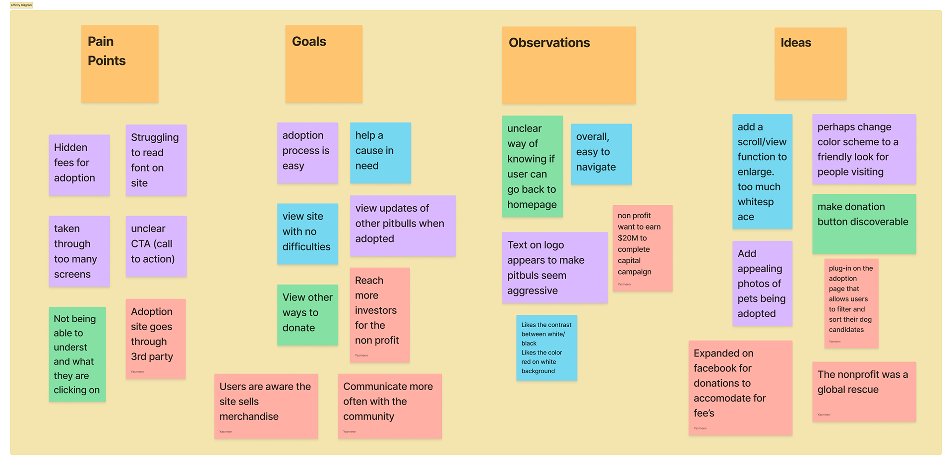
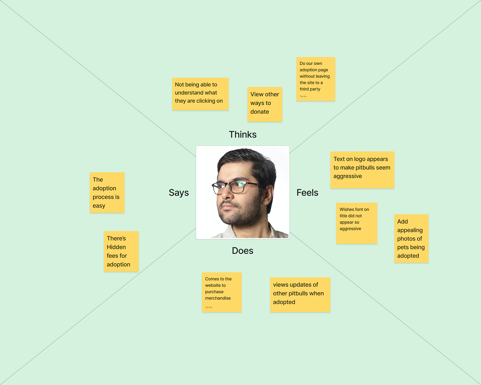
We then organized the affinity diagram into an empathy map to describe how our typical user sees, hears, says & does thinks and feels.
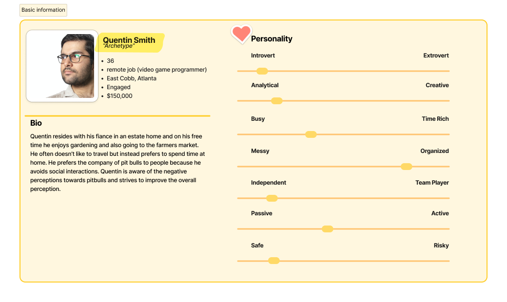
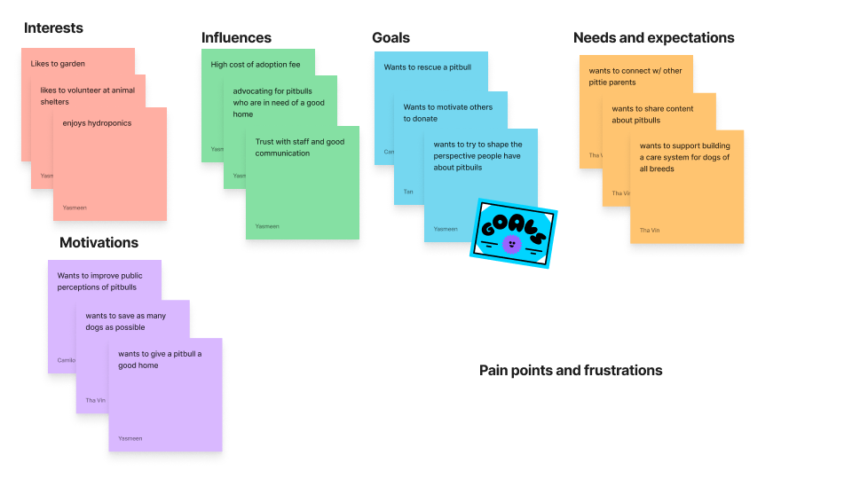
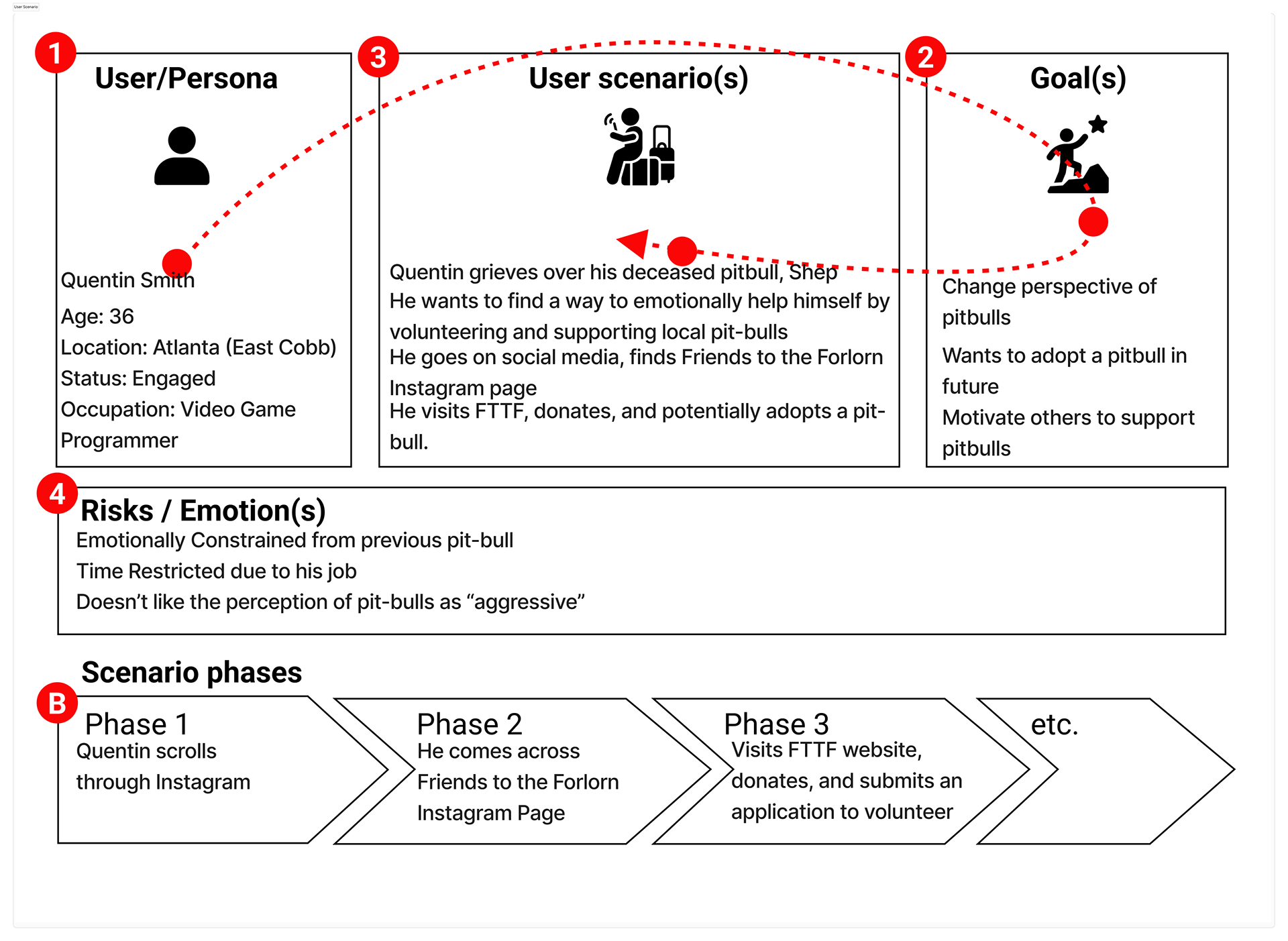
Quentin wants to find a better and easier way to support local pit-bulls so he can help future pit-bulls not end up at an adoption shelter and find a stabilized, happy, and healthy household.
Quentin Smith, a remote video game programmer, needs to support the injured pit-bull’s in order to consolidate the grievance he endured when he lost his first pit-bull.
The user scenario describes the process Carlos goes through when his pitbull passes away and he want to reach out to pit bull rescue to emotionally help himself.
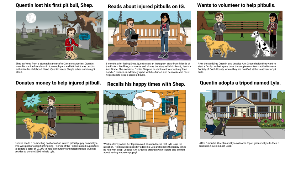
The storyboard illustrates Quentin's journey to discover a pit bull rescue after the death of his pit bull.
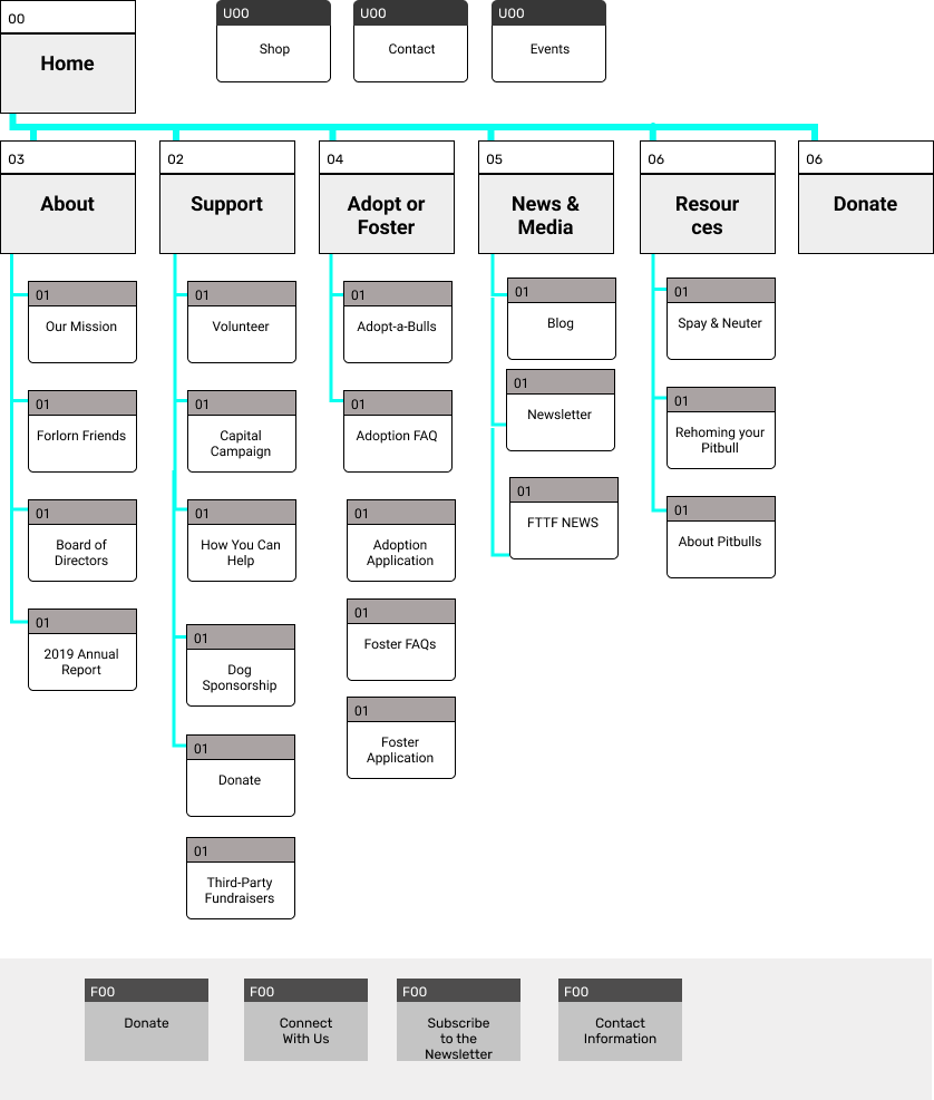
I mostly kept the site map the same with few changes. I consolidated Adopt and Foster into the same dropdown because they are similar functions. We created a new tab for News and Media which took Blog and Newsletter from the global navigation at the top of the page.
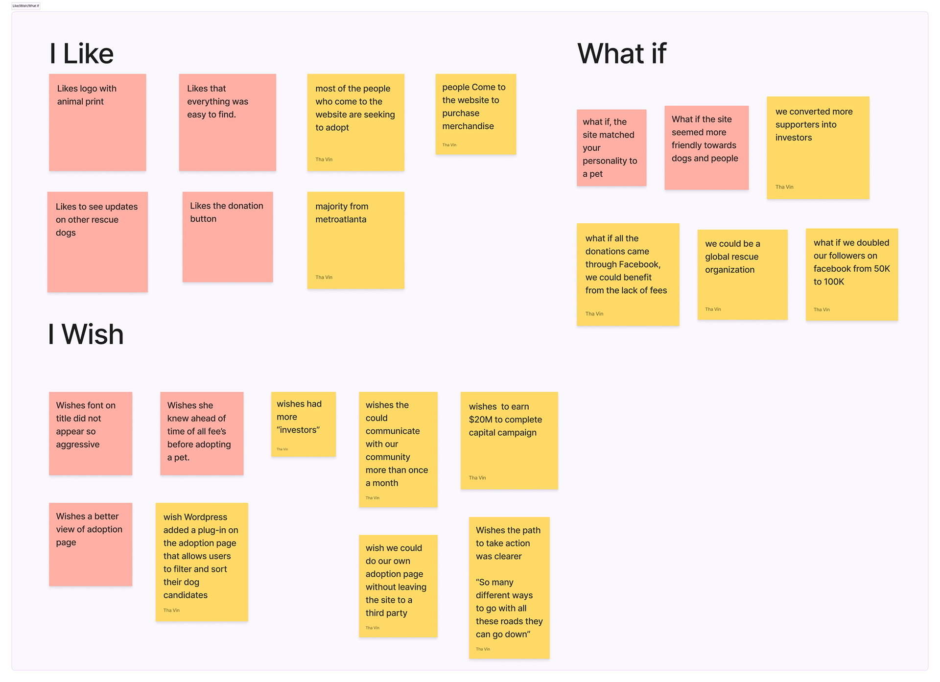
In order to identify which features to improve for FTTF , we noted ideas into categories of "I Like", "I Wish" and "What If". We put items we wanted in the app into I Wish and ideas where the sky is the limit went into "What if".
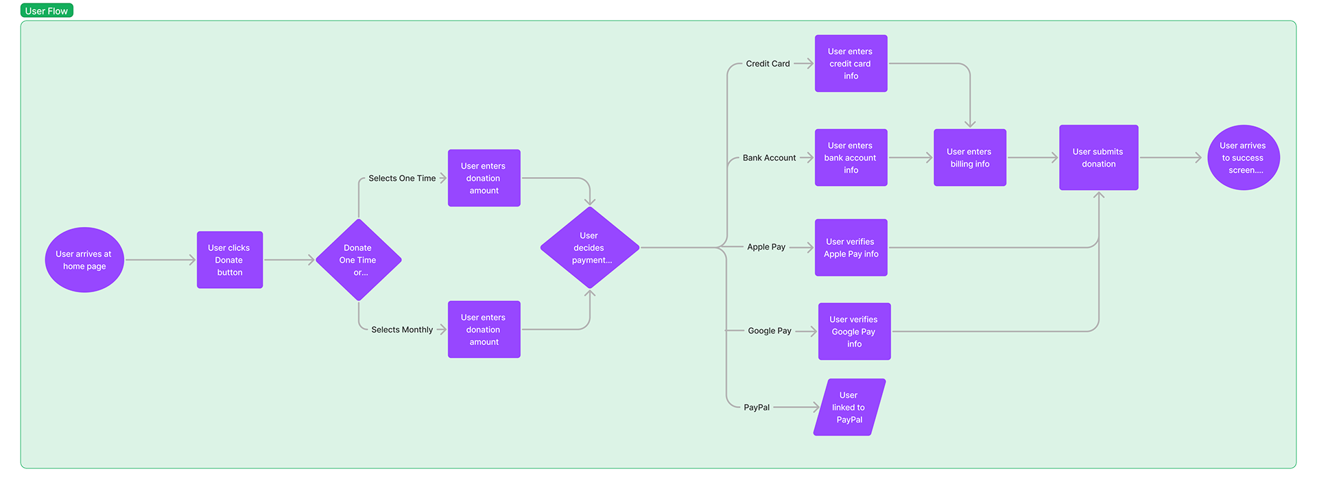
I decided the donation process could be the most improved on. I designed our user flow to be straight forward for users to make a difference to FTTF and donate. When the user clicks on donate, they can select to do a one time donation or a monthly donation. They will they choose their donation amount, payment method and submit their donation.
We decided to have a rotating carousel of pit bulls that are available to adopt at the top of the page to empathizes with users. We also included success adoption stories as the user scrolls down the page.
We decided a hamburger menu would be best for containing the menu on mobile.
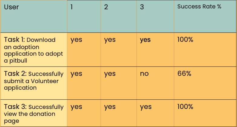
Our user testing plan, included 3 tasks to be completed by three users. We had users download an adoption application, submit a volunteer application, and view donation page. Most users were able to complete these tasks. During our testing, we did find that the $2 Tuesdays and $5 Fridays option was confusing to user because it looked like a subscription when it wasn't. So we decided to remove that feature, moving towards the high fidelity.
In our final prototype for the project, I made the design more high fidelity by adding images, and implementing style guide.
Our next steps to improve the project include reconvening with stakeholders to identify any more enhancements.